- Role
- UX Architect
- Company
- Apple, Purchasing Power
- Timeline
- 2015 | 2 months
Overview
When Apple Watch was released in 2015, it quickly became the best-selling wearable device on the market. However sales began to soften in the months that followed. As a way of regaining its momentum, Apple began focusing on the smartwatch’s health-related features with offerings such as Apple Watch Nike+ and an Apple Wellness employee purchase program.
Making a good thing better
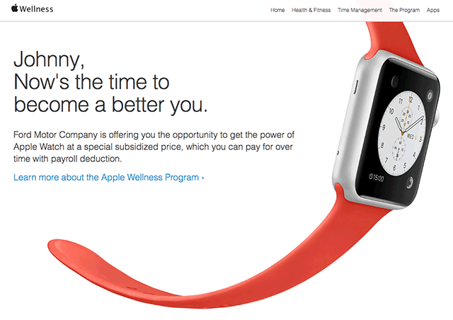
The Apple Wellness employee purchase program was a year-long pilot initiative, where partner companies offered their employees a subsidised Apple Watch through a company wellness program.
To make it even more enticing and easier for employees to purchase an Apple Watch, Apple partnered with Purchasing Power to integrate their proprietary payroll deduction system to allow participant employees the option to pay for their Apple Watch through direct payroll deduction over the span of several months.
Go to ResultsThe Challenge
For the proof of concept for this project, the site would be created by Purchasing Power. And as the sole internal UX resource, it was my job to ensure that what was delivered was not only up to Apple’s standards, but also met the expectations of their users.
Due to an aggressive timeline and a limited budget, there was unfortunately no opportunity for project-specific user research. This led us to rely heavily on the precedence of Apple’s existing user experience and the groundwork done by both Apple and Ideo.
The Checkout Funnel
From a UX perspective, the single biggest opportunity was the checkout flow. The existing Purchasing Power checkout user experience has always been a… challenge. Between long-standing policies and executive apprehension, any attempts to make significant change to the checkout funnel were always met with Sisyphean results. This, in spite of considerable research and user feedback.
With the Apple Wellness project, I could approach checkout with a clean slate – applying my previous findings to offer users a much cleaner and easier experience. And prove-out some new concepts that might become a part of the core offering in the future.
The Approach
Because of the aforementioned limitations, the website would largely distill the existing Apple online user experience, with a new focus on wellness, and provide a streamlined checkout flow that included the option for payroll deduction.
Information Architecture
Given a prescribed overall experience, content and information architecture became my primary focus. Since its release, there have been an ever-growing number of wellness-related features and apps for the Apple Watch. Highlighting these would be simple enough. More challenging was introducing the wellness program – and moreover a new purchase option to an audience to which we had little to no exposure.


Wireframes

Prototype

Control Group
As a way of testing the effectiveness of the payroll deduction feature, some versions of the site were launched with both payroll deduction and credit card payment options, while others offered credit cards as the only option for purchase.
Results
Following this initial proof of concept, the project was expanded to integrate with another Apple partner’s existing e-commerce platform.
Once the program went live, it quickly proved its worth; showing an immediate increase in sales.
The sites that offered payroll deduction showed more than a 400% greater penetration than those accepting only credit cards – with users choosing payroll deduction over credit card more than 80% of the time.
The checkout flow also showed to be an improvement over the legacy checkout experience, with analytics exhibiting a lower abandonment and higher conversion rate. As a result, the core Purchasing Power checkout UI began to integrate features from this newer design.