- Role
- UX Architect
- Company
- Purchasing Power
- Timeline
- 2017 | 1 month
Overview
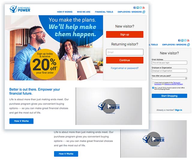
Purchasing Power is a unique e-commerce website, offered as a voluntary benefit to employees of partnering companies. Because it is not open to the general public, all users of the site must first register and login before they can shop.
In 2017, Purchasing Power sought ways to bolster new users. This led us to work on improving the registration experience and make it easier for both new and returning customers to access the storefront.
Go to ResultsThe Challenge
Presenting a barrier to access and shop on a website is fundamentally counter to the idea of making a site easy to use. However, the nature of Purchasing Power’s business model requires that very thing.
Historically, before new users could enter the site, they had to provide a considerable amount of information to satisfy the needs of several different business units. This included client services, marketing and risk, among others.

The Approach
With consideration to the needs of the business, the question became; how can we minimize friction during the registration process while still collecting the proper information at the proper moment in the website user flow?
Based on the information that was required at registration, we met with the appropriate stakeholders to understand why this information was being collected and when it became important to them. Was all of this data truly critical at the time of registration? Was this information that could be collected later into the experience without a negative impact to the business?
User Research
Analytical data around the registration process, as well as relevant findings from previous user testing were compiled and synthesized. There were no real surprises. The findings served to reinforce our existing hypothesis that the total number of fields and multiple steps led to frustration and abandonment.
Competitive Analysis
In addition to user research, we explored the login and registration experiences for a number of websites. These included membership-based sites as well as banks and lending institutions, where a greater amount of information and more sensitive data is required of the user.
User Flow
Having a clearer understanding of the needs of both the business and users, I began developing a user flow diagram to better understand and communicate the technical aspects of the login and registration process.
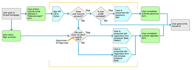
After the release of the redesigned registration expereince, two factor authentication was introduced.
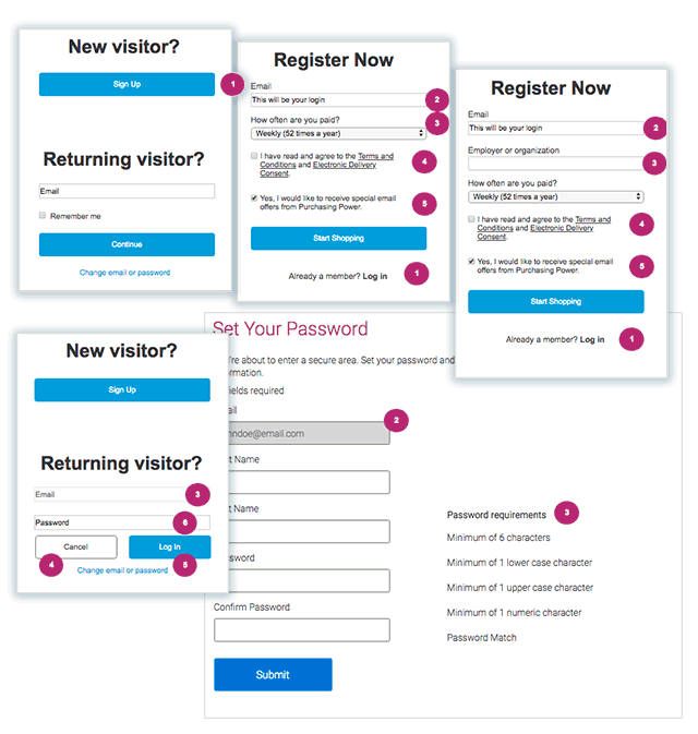
Wireframes & Prototype

User Testing
Once we had an interactive prototype, we put it in front of a number of people who had never gone through the Purchasing Power registration process. We also surveyed several existing users, to see how they compared the new approach with the existing experience. Overall, the prototype proved to offer a much easier registration experience.
Accessibility
While taking a fresh approaching to the design, there was an additional opportunity to address several accessibility issues, including poor color contrasts and small click target size.
During the design phase, colors for the login and registration interface were chosen to not only fit with brand guidelines, but also meet WCAG 2.0 contrast standards. Buttons and other clickable elements were sized based on both mobile best practices and accessibility considerations for users who may have motion disorders.
Results
Success for this project was measured on the increase in new registrants to the storefront website. By that standard, the new registration experience was a resounding success, with a 58% increase over the previous year. This translated to a 39% year-over-year increase in first time buyers.